Armadillo is an investment app that's geared towards teaching users about the stock market in order to make investing money simple and accessible to anyone. I created this app in order to solve a need that I see in the lives of those around me.
THE PROBLEM:
I think it's safe to say that most of us have heard about the importance of saving for your future at some point in our lives. This is something that continues to weigh heavier on our minds, the older we get. We try to save with our 401Ks and by setting aside savings, but when it comes to investing, many people don't know where to even start. They tend to feel overwhelmed by the thought of the stock market. While there are many apps out there that make for easy investing in the stock market, none are necessarily aimed at teaching the user the basics.
The idea behind Armadillo is to create an investment app geared towards providing users with the tools and information they need to learn about the stock market and to guide them based on their individual needs.
NORTH STAR VISION AND GOALS WITHOUT LIMITS:
- Create a fully interactive learning experience tailored to individual needs
- Make the stock market feel more accessible to beginners
- Keep users engaged on a consistent basis either investing or learning
- A course to teach kids about the stock market
- Possibly incorporate an AI personal assistant that can provide personalized help
- Integrate with Google Assistant, Alexa, and Siri
USER RESEARCH:
The user research I conducted shed some interesting light on how people feel about investing in the stock market. Users came from a diverse background of career industries, and ranged in age from their early to mid 20s to 65 years old.
COMPETITIVE ANALYSIS:
PERSONAS AND EMPATHY MAPS:
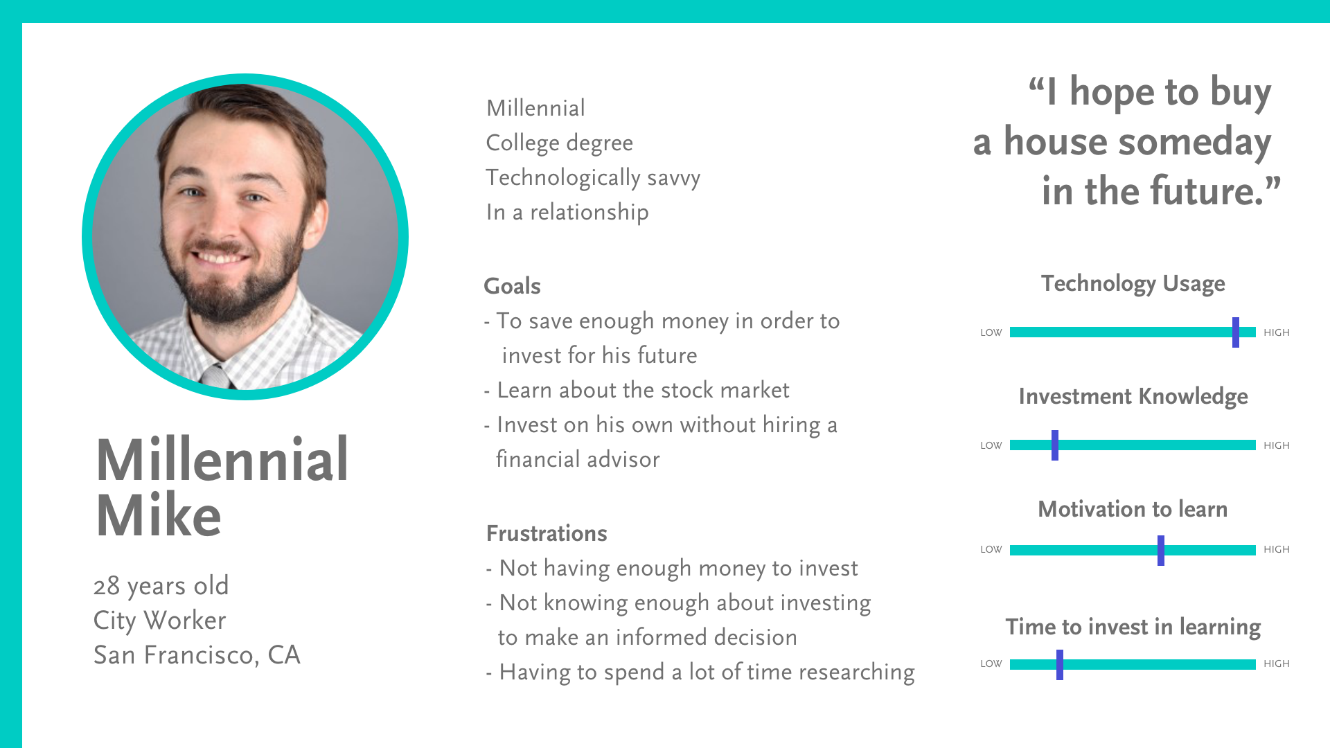
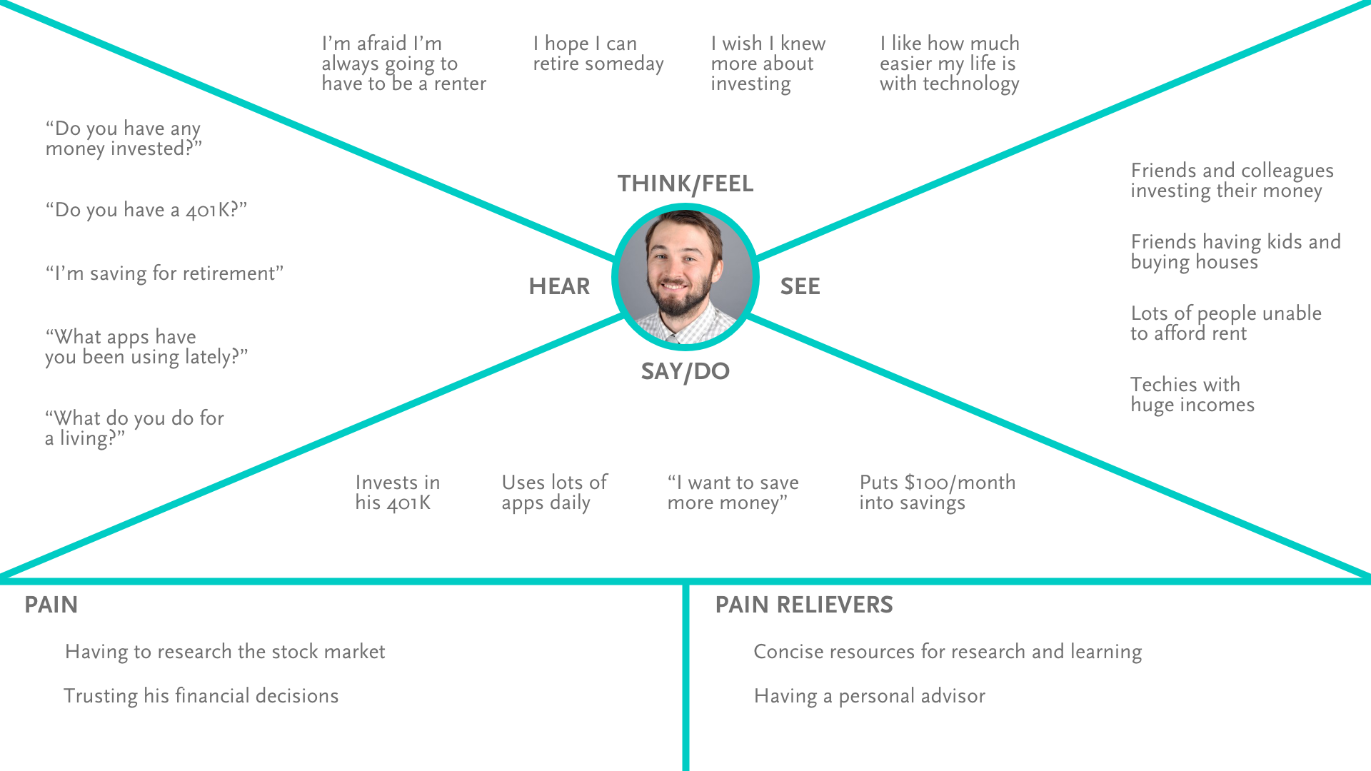
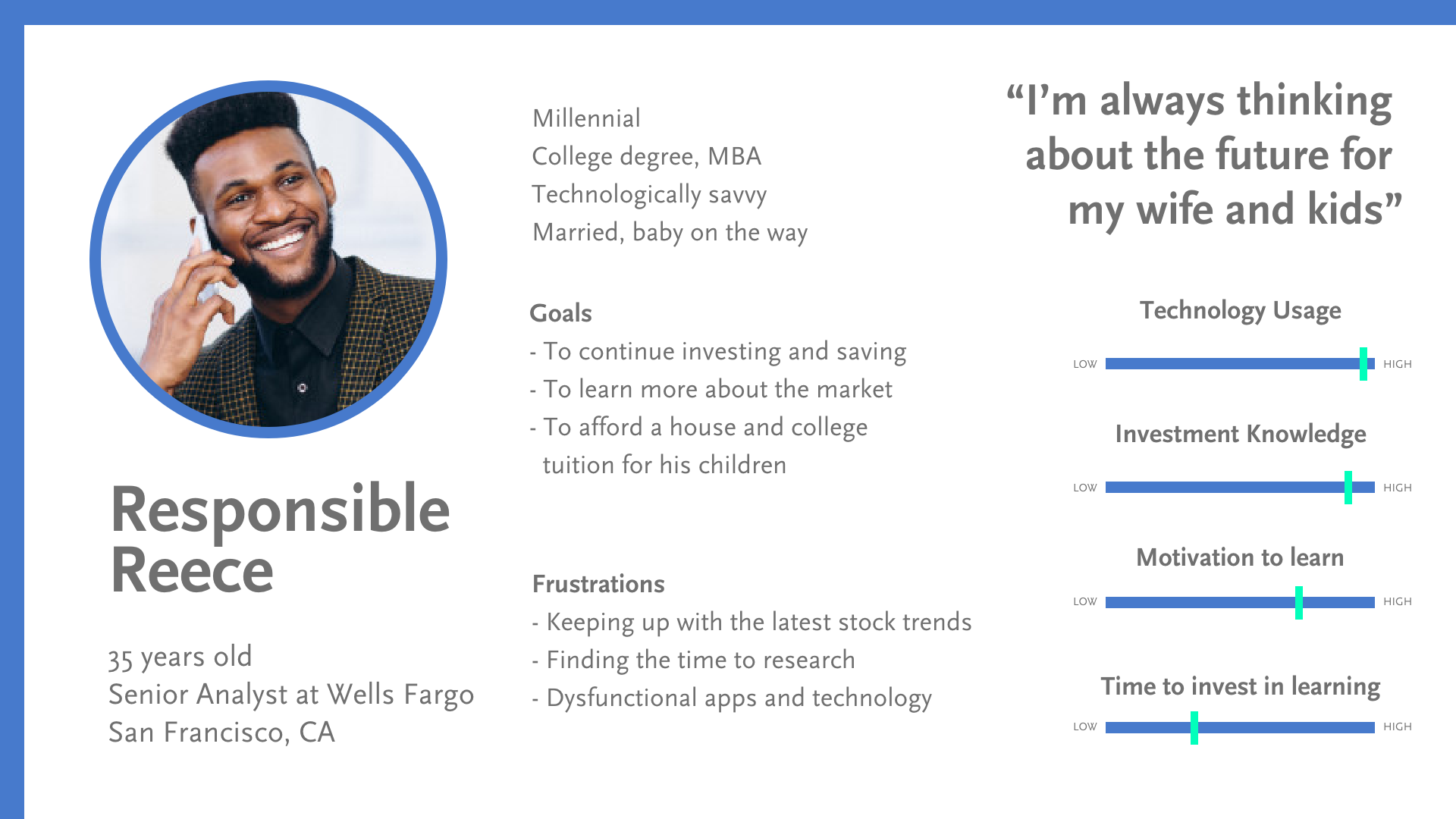
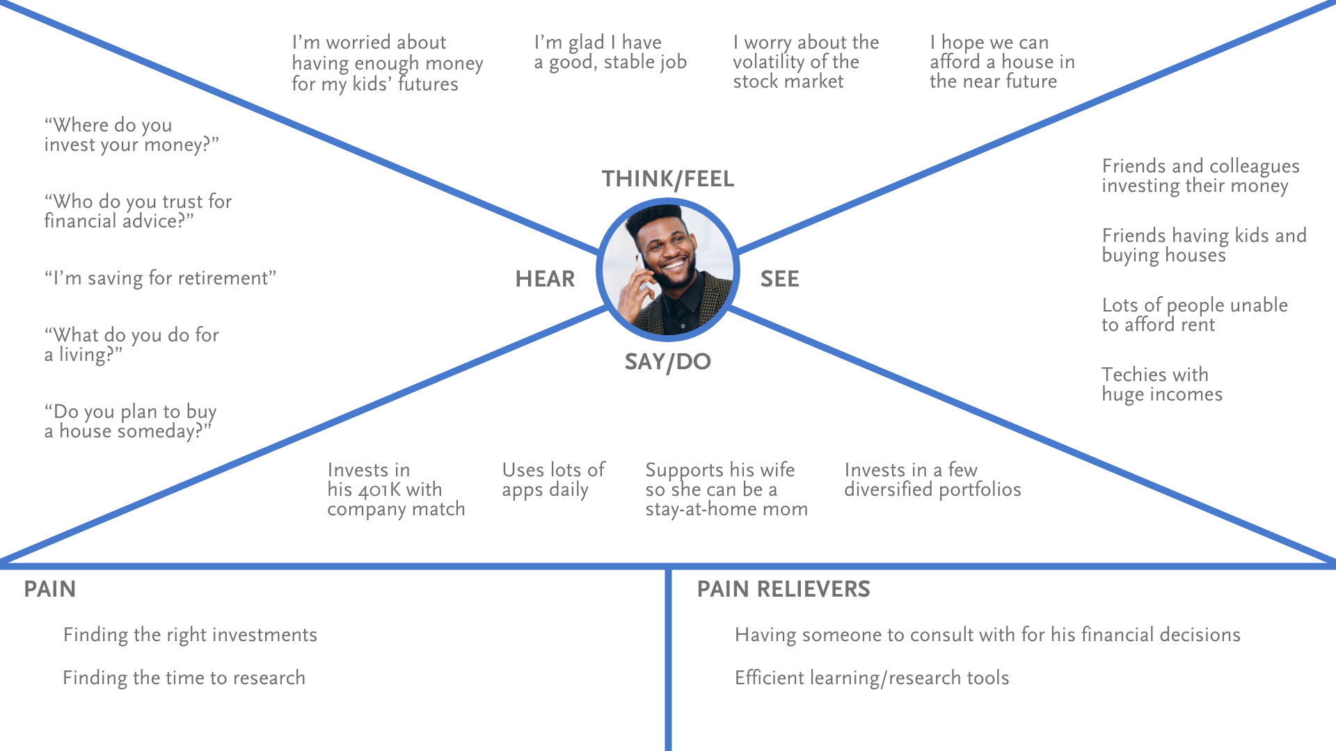
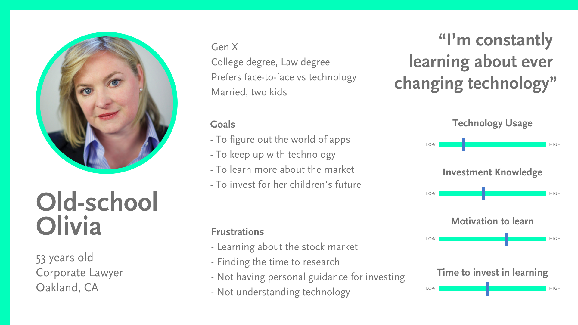
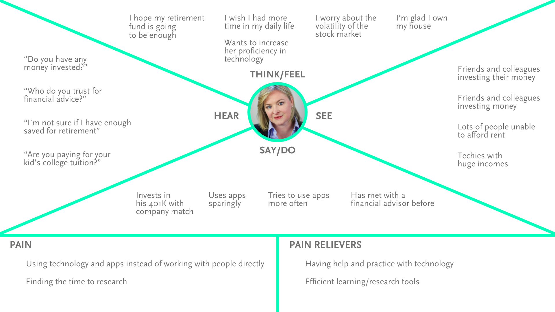
After my initial user research, I used the insights gathered in order to create three core personas and corresponding empathy maps.
INFORMATION ARCHITECTURE:
After conducting my user research and developing personas, I conducted a card sort in order to get a clear picture of how the site map should be
organized. With this information I was able to gain insight into how users like to categorize and organize information best, and created a site map and
some key user flows.
organized. With this information I was able to gain insight into how users like to categorize and organize information best, and created a site map and
some key user flows.
USER FLOWS:
WIREFRAMES:
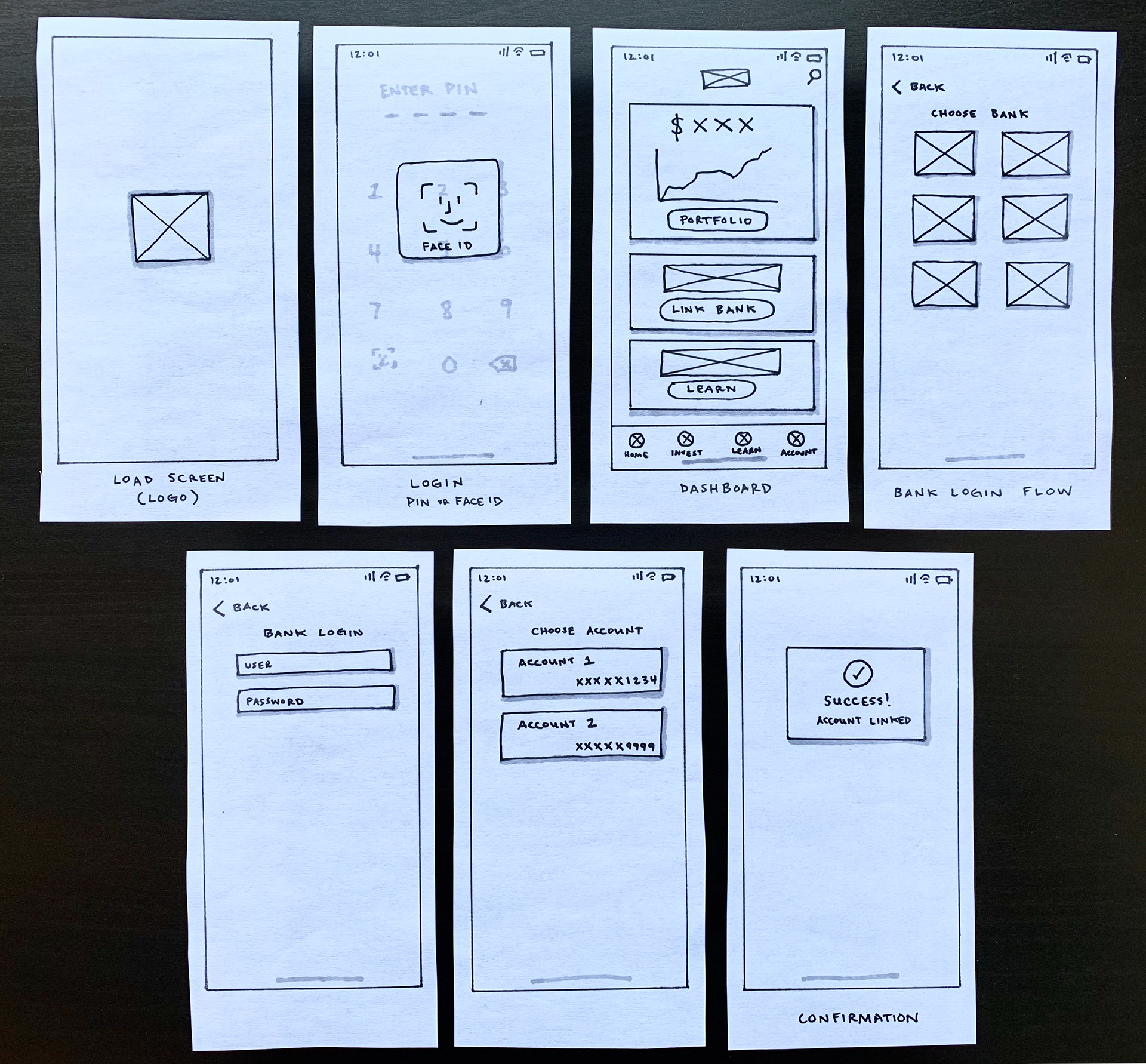
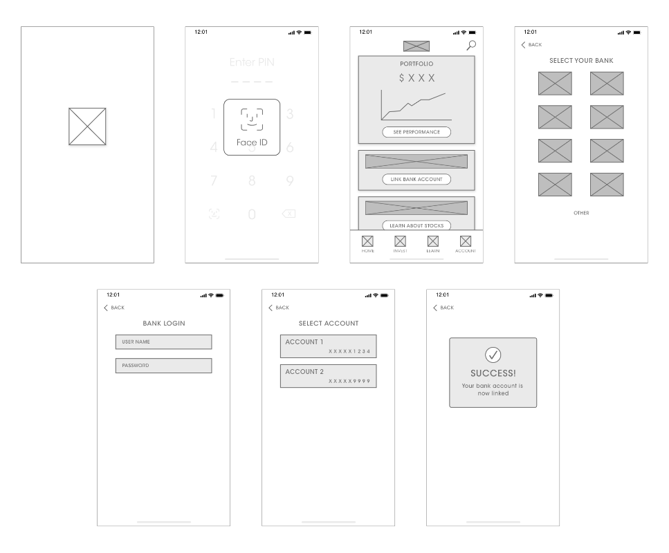
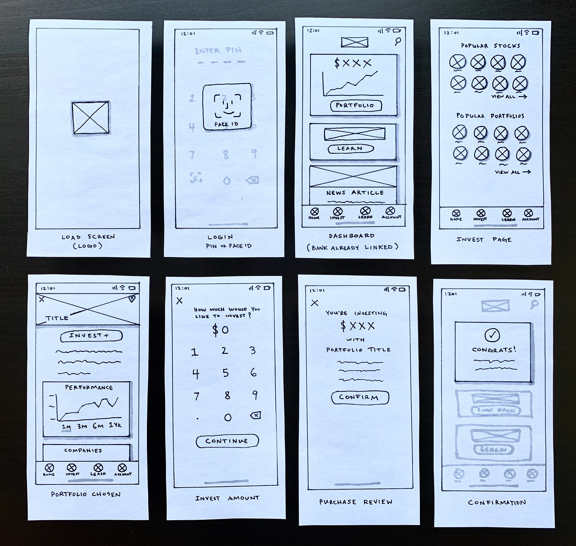
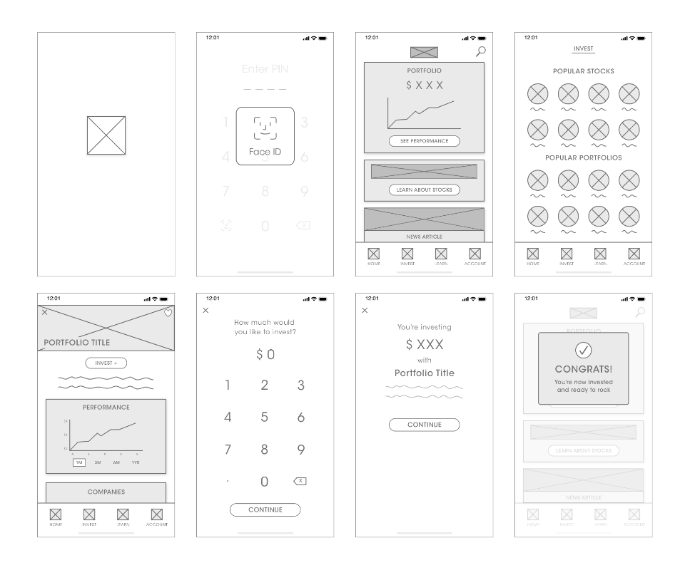
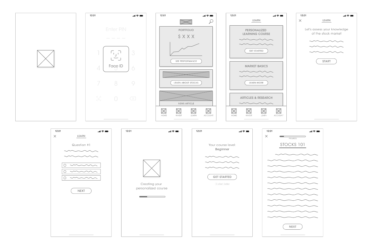
Using the three user flows I created I then turned each of them into a set of wireframes. I started out with sketches, then made more polished paper drawings, and finally made digital versions for ultimate clarity.
Using the three user flows I created I then turned each of them into a set of wireframes. I started out with sketches, then made more polished paper drawings, and finally made digital versions for ultimate clarity.
Linking bank account flow
Investing in a portfolio flow
Personalized learning course flow

INITIAL MOCKUPS FOR USER TESTING:
After creating a basic prototype of the app, I set out to conduct user interviews. I wanted to test on discover-ability and ease of use for some features, but mostly focus on finding out what the users would want or expect to see. One of the most important features I wanted to highlight was the learning tool, and seeing how people prefer to be taught from an app. My chosen interview subjects were specifically based on the three personas for our target audience.
Here are the key findings from these interviews.
MAIN TAKEAWAYS:
– The app was well received overall. Users felt there was an appropriate amount of information without overwhelming.
– Market savvy users were not as inclined to take the knowledge assessment, as it looks like it's for beginners. There wasn't an obvious option for them to learn on a more advanced level.
– There were mixed preferences of learning styles. Some would prefer a list of articles where others would like an interactive visual tutorial.
– Users want more context and information about each particular investment portfolio, such as risk estimate.
– Users felt that the performance graph could be more discoverable and individual holdings should also show performance history.
- Some inexperienced users wanted a little more assistance in the purchasing flow since they weren't sure how stock work yet.
INTEGRATION:
After gathering my insights I made some changes to the design based on user feedback. Most changes were minor for better functionality or discoverability. I added some dark sections to separate and draw attention to specific features. The primary focus coming out of this will involve building the learning assessment and tutorials. There will be more rounds of user testing for that in the near future.

