My role at Dell consists of a wide range of UI/UX processes. I work on both Commercial and Consumer software with a small yet agile team of experience designers and researchers. My responsibilities include high-level concepting, journey mapping, research analysis and implementation, story-boarding, wireframing, prototyping, interaction design, high fidelity visual design, and user testing.
OVERVIEW
The concept behind Dell Modern Workspace is to create an all-in-one platform for access to everything you might need on any device.
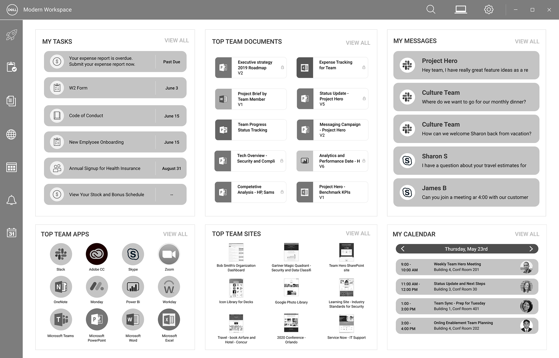
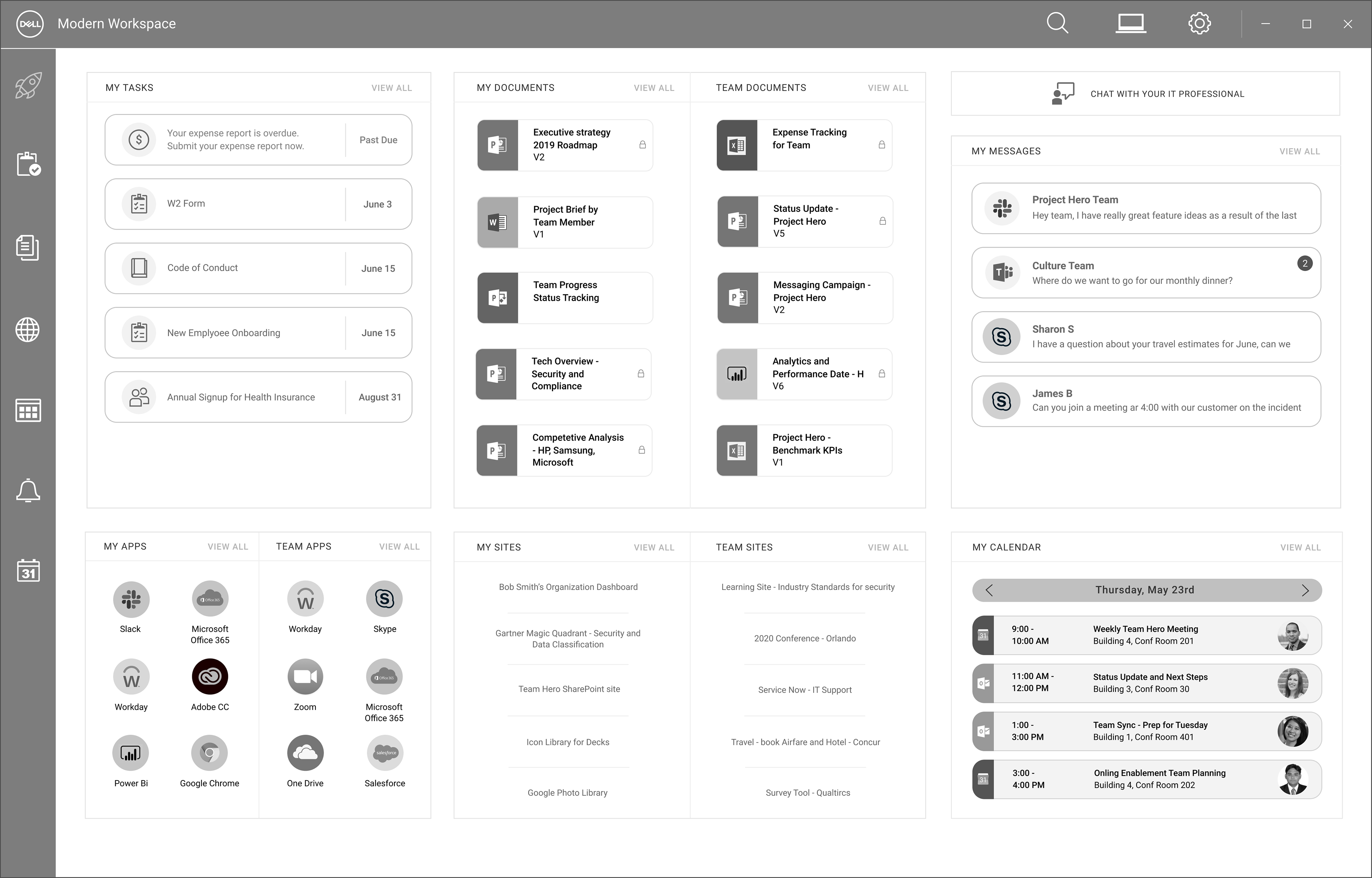
In just one screen you can see your projects, messages, calendar, document, apps, sites, and team members without having to navigate to other apps. It will seamlessly integrate with all of your other services such as Outlook, Skype, Jira, Microsoft Projects, etc. This will not only maximize productivity, but also improve the employee onboarding experience. They will have immediate access to what they need, including the top documents used by the team.
WHITEBOARD SESSIONS
After a couple of brainstorming sessions with the team it became clear that this product would be packed with a ton of features in order to live up to our expectations. Since the idea is to have an all-in-one platform, we have to include every possible integration so the user doesn't need to switch apps.
A VISUAL FEAT
After a couple of brainstorming sessions with the team it became clear that this product would be packed with a ton of features in order to live up to our expectations. Since the idea is to have an all-in-one platform, we have to include every possible integration so the user doesn't need to switch apps.
SO MANY DETAILS
The most thematic development of my wireframes was creating a clean uncluttered dashboard. After each iteration I tried to simplify and minimalize each element in the next. The navigation also needed to be clear and sensical as it pertains to the sections. Once we had a version we were satisfied with, we began user interviews.


A VERY USEFUL CONCEPT
We conducted our user interviews with a mix of knowledge workers and IT admins. We wanted to determine the concept's usefulness and value for productivity as well as learn what features users would want or expect to have. Before showing the prototype, we asked users to discuss their current work process and tools for organization and collaboration as it relates to documents and projects. The most common frustrations seemed to stem from difficulties locating documents and having duplicate work across teams without a single source of truth.
The overall sentiment towards Modern Workspace was very positive. Several users even declared that they really needed something like this. The features that were ranked most valuable were projects and tasks as well as documents. They found it as extremely useful to be able to track all projects and documents in one place. Some users had concerns over document security and who can view them. The lowest ranked features included chat with IT and the personal assistant. Most saw the assistant as unnecessary and would likely ignore any sort of notifications from it.
Our user interviews gave us some really valuable perspective and insight for our concept. We're excited to move forward with it into the next phase. The direction for this will be decided in the near future and I will update this as we move along.
HIGH FIDELITY DESIGN
Once we had all of our user feedback and a clear direction I began updating the visuals to a much more realistic look and feel. This screen is specifically for an IT admin, as they have access to reporting and managing the organization.
This project is still in progress and I'll update as we move forward!
